ArtsAutosBooksBusinessEducationEntertainmentFamilyFashionFoodGamesGenderHealthHolidaysHomeHubPagesPersonal FinancePetsPoliticsReligionSportsTechnologyTravel

A HTML 5 CSS 3 Tutorial Creating 3D Special Effects: More on Rotation & Introduction to Animation

Updated on May 11, 2014

Goals of This Tutorial

In our previous tutorial we looked at rotations around the x- and y- axis. This was basically a review of 2D rotations. There really was not anything different there. The difference cam with the introduction of the transformations with regard to perspective and perspective-origin which give the illusion of a 3D figure and a reference point as to how close an object is to the viewer.

In this tutorial we complete our discussion of rotations by showing the implementation of rotations around the z-axis.

We then embark on a discussion of basic animation. This will set the groundwork for our implementing movement and rotation of 3D objects.


Thinking in 3D
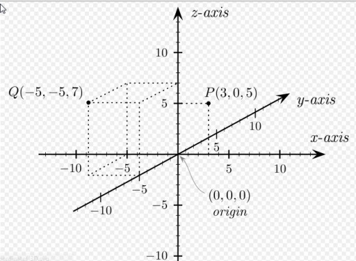
To successfully create three dimensional object onw has to begin thing in terms of: height, width and depth along the x- y- and z- axis.

Adding The rotateZ() Method

If you followed along our previous tutorial, A HTML 5 CSS 3 Tutorial; Creating 3D Special Effects (Part I): Basic Rotation the HTML code in the snapshot which follows should not be very surprizing. That tutorial covered the rotateX() and rotateY() methods which along with the perspective properties creates the illusion of 3D along the x-axis and/or y-axis. We merely in this example add another dimentsion, the z-axis, or depth.

Rotate Transformations
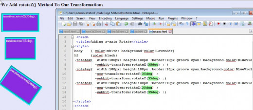
Syntactically, the rotateZ() method merely substitutes the z-axis for x- or y-. The meaning lies in the rotation for depth.

The Other z-axis Specific Methods

The two additional methods which are specific to the z- access are:

  • translateZ() - the element moves from its current position, depending on the parameters given for z-axis
  • scaleZ() - the element increases or decreases the size, depending on the parameters given for the z-axis (depth).

We have the following illustration and if you play with the values for the code changing translateZ() and scaleZ() seem to have little effect. This is because at this point in time depth has really little effect. It olny will become important when working with true 3D objects, such as a cube which we will cover in the next tutorial.

Strange Behavior?

This may seem counter intuitive given the dramatic range in values. Try it yourself for any range of values
Again, the example here represents correct code. The standard answer is that DOM elements do not in general reflect depth. More on that in the next part of our tutorials when we look at true 3D figures.

"Shorthand" 3D Method

The following methods can be used to xake modifications on all 3 axes by invoking one method. In that sense it prevents unexpected results which can occur when multiple transformations are applied. Remember that the order of transformation application can have an impact on the end result.

rotate3d(x,y,z,angle) - defines a 3D rotation

scale3d(x,y,z) - a value of 1 will preserve the original value. A need for scaling along the z-axis seems unnecessary first, as DOM elements usually do not have any depth. (We will discuss a use in Part III of this short tutorial series).

translate3d(x,y,z) - a movement along 3 axes

matrix3d (n,n,n,n,n,n,n,n,n,n,n,n,n,n,n,n) - a 3D transformation, using a 4x4 matrix of 16 values. The identity function in this case is matrix3d(1, 0, 0, 0, 0, 1, 0, 0, 0, 0, 1, 0, 0, 0, 0, 1). A full discussion is beyond the scope of this tutorial. A good place to start trying to understand it would be looking at my discussion of the 2D matrix in a previous tutorial.

A Small Step Towards Animation

Effects can be made utilizing CSS rather than having to rely on JavaScript or Flash. In CSSthis is referred to as transitions.

CSS3 transitions are effects that let an element change from one style to another.

Two things must be specified in order to accomplish this:

  • the CSS property you want to add an effect to (e.g. width, height, color)
  • the duration of the effect (the length of time require to allow the change to take place (e.g. 2s, for 2 seconds).

The standard specification is the name transition which is the W3C official name. Based on your browser's version you may have to specify -webkit-, -o-, -ms-, -moz-, etc.

Not that if the duration is not specified the transition will not take place.

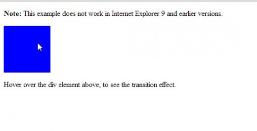
The following code is for the snapshot effect which follows:

<!DOCTYPE html>
<html>
<head>
<style> 
div
{
width:100px;
height:100px;
background:red;
-webkit-transition:background 20s; 
transition:background 20s;
}
div:hover
{
background:blue;
}
</style>
</head>
<body>
<p><b>Note:</b> This example does not work in Internet Explorer 9 and earlier versions.</p>
<div></div>
<p>Hover over the div element above, to see the transition effect.</p>
</body>
</html>

Example of A Color Transition
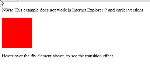
This is the HTML code before the transition due to hovering over the block
The transition of the block from red to blue.

Wrap Up and What's Next

In this tutorial we completed discussing the methods involved in CSS 3D object creation. Some of them may seen a little strange when referring to the z-axis. They hopefully will make more sense when we get into discussing real 3D objects in the next tutorial.

We touched on animation in the last example. It was the first "stab" at animation with CSS. In the next tutorial you will see a more robust way to animate with a 3D object.

Please Comment And Rate This Tutorial

Cast your vote for Your comments and rating are appreciated. Thanks!
working

This website uses cookies

As a user in the EEA, your approval is needed on a few things. To provide a better website experience, hubpages.com uses cookies (and other similar technologies) and may collect, process, and share personal data. Please choose which areas of our service you consent to our doing so.

For more information on managing or withdrawing consents and how we handle data, visit our Privacy Policy at: https://corp.maven.io/privacy-policy

Show Details
Necessary
HubPages Device IDThis is used to identify particular browsers or devices when the access the service, and is used for security reasons.
LoginThis is necessary to sign in to the HubPages Service.
Google RecaptchaThis is used to prevent bots and spam. (Privacy Policy)
AkismetThis is used to detect comment spam. (Privacy Policy)
HubPages Google AnalyticsThis is used to provide data on traffic to our website, all personally identifyable data is anonymized. (Privacy Policy)
HubPages Traffic PixelThis is used to collect data on traffic to articles and other pages on our site. Unless you are signed in to a HubPages account, all personally identifiable information is anonymized.
Amazon Web ServicesThis is a cloud services platform that we used to host our service. (Privacy Policy)
CloudflareThis is a cloud CDN service that we use to efficiently deliver files required for our service to operate such as javascript, cascading style sheets, images, and videos. (Privacy Policy)
Google Hosted LibrariesJavascript software libraries such as jQuery are loaded at endpoints on the googleapis.com or gstatic.com domains, for performance and efficiency reasons. (Privacy Policy)
Features
Google Custom SearchThis is feature allows you to search the site. (Privacy Policy)
Google MapsSome articles have Google Maps embedded in them. (Privacy Policy)
Google ChartsThis is used to display charts and graphs on articles and the author center. (Privacy Policy)
Google AdSense Host APIThis service allows you to sign up for or associate a Google AdSense account with HubPages, so that you can earn money from ads on your articles. No data is shared unless you engage with this feature. (Privacy Policy)
Google YouTubeSome articles have YouTube videos embedded in them. (Privacy Policy)
VimeoSome articles have Vimeo videos embedded in them. (Privacy Policy)
PaypalThis is used for a registered author who enrolls in the HubPages Earnings program and requests to be paid via PayPal. No data is shared with Paypal unless you engage with this feature. (Privacy Policy)
Facebook LoginYou can use this to streamline signing up for, or signing in to your Hubpages account. No data is shared with Facebook unless you engage with this feature. (Privacy Policy)
MavenThis supports the Maven widget and search functionality. (Privacy Policy)
Marketing
Google AdSenseThis is an ad network. (Privacy Policy)
Google DoubleClickGoogle provides ad serving technology and runs an ad network. (Privacy Policy)
Index ExchangeThis is an ad network. (Privacy Policy)
SovrnThis is an ad network. (Privacy Policy)
Facebook AdsThis is an ad network. (Privacy Policy)
Amazon Unified Ad MarketplaceThis is an ad network. (Privacy Policy)
AppNexusThis is an ad network. (Privacy Policy)
OpenxThis is an ad network. (Privacy Policy)
Rubicon ProjectThis is an ad network. (Privacy Policy)
TripleLiftThis is an ad network. (Privacy Policy)
Say MediaWe partner with Say Media to deliver ad campaigns on our sites. (Privacy Policy)
Remarketing PixelsWe may use remarketing pixels from advertising networks such as Google AdWords, Bing Ads, and Facebook in order to advertise the HubPages Service to people that have visited our sites.
Conversion Tracking PixelsWe may use conversion tracking pixels from advertising networks such as Google AdWords, Bing Ads, and Facebook in order to identify when an advertisement has successfully resulted in the desired action, such as signing up for the HubPages Service or publishing an article on the HubPages Service.
Statistics
Author Google AnalyticsThis is used to provide traffic data and reports to the authors of articles on the HubPages Service. (Privacy Policy)
ComscoreComScore is a media measurement and analytics company providing marketing data and analytics to enterprises, media and advertising agencies, and publishers. Non-consent will result in ComScore only processing obfuscated personal data. (Privacy Policy)
Amazon Tracking PixelSome articles display amazon products as part of the Amazon Affiliate program, this pixel provides traffic statistics for those products (Privacy Policy)
ClickscoThis is a data management platform studying reader behavior (Privacy Policy)