- HubPages»
- Technology»
- Computers & Software»
- Computer Science & Programming»
- Computer Programming Tutorials
A HTML5 CSS3 Tutorial On Creating Special Effects: Creating A Rotating Cube
The Goal of This Tutorial: A Rotating Cube
In this tutorial we will create a cube in HTML5 and CSS. It will be a stepwize process and we will try to be as clear as possible with some of the coding that you might not be aware of if you are just a beginner.
We will avoid making it too complex and for that reason the code will be minimal.For example statements which might be browser dependent will me minimized. Thus you will find -webkit- and W3C official naming in the code, but no -ms-, -o-, -moz- references for the sake of brevity. The final section of this tutorial will have the complete code which is guaranteed to run in a Chrome environment.
Future tutorials will refer back to this model with some specific suggestions for enhancement. Steps leading up to the final version will have the code snippets necessary for the final example. So if you buildup the code section by section at the end of this tutorial you should have a complete running model. The final section code is ther if you want to copy it or for some reason you have a typo in what you created.
Our Finished Cube: Several Views
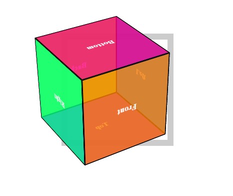

Let's Start Looking at A Cube
You might want to get a block of wood, a box of tea, something material that you can model It may help later to have a physical object to compare with the code.
A cube has six sides and i labeled mine: top, bottom, left, right, front, and back. Nowlet's start with Step #1.
Our Cube Positioned Before Animation
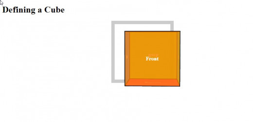
Step #1: Create or Copy the HTML Framework
For sake of clarity and having everything in one file, I will be including all of my styling in the HTML file.
My HTML framework looks like the following:
<!doctype html>
<html lang="en">
<head>
 <meta charset="utf-8" />
 <title>Building a 3D Object: A Cube</title>

 <style>
</style>
</head>
<body>
</body>
</html>
This should be pretty much self-explanatory,
Step #2: The Cube Layout Code
The cube has six side as mentioned above: top,bottom,left, right, front, and back. In previous version of HTML one would have to create surface of the cube with a <div>. Nowadays, one can use the <figure> tag. Although the side do not have a <figcaption>, I believe that this is a good use of the <figure> tag since we will be labeling each side.
Each side participate in the cube structure in a particular way, there it is necessary to identify each with an <id> or <class>. Perhaps later on you will want more than one cube displayed on your screen so a good option might be to create each ifure in its own class rather than in an <id>.
The CSS properties are inherited from parent element. Our cube surfaces are children of the cube so they are wrapped within a cube element. The cube itself inherits properties from its parent a container.
This "wrap" within a "wrap" is coded as follows where I have chosen to set the container as a <section> and the cube as a <div> within it.
<body>
 <h1>Defining a Cube</h1>
 <section class="container">
 <div id="cube" class="spinning">
 <figure class="front">Front</figure>
 <figure class="back">Back</figure>
 <figure class="left">Left</figure>
 <figure class="right">Right</figure>
 <figure class="top">Top</figure>
 <figure class="bottom">Bottom</figure>
 </div>
 </section>
</body>
</html>
I added a <h1> tag as the only other text to be displayed. This code is all that the <body> will consist of.
Step #3 :Styling the Container - Giving the Cube Perspective
What the contain really provides to the cube is the perspective property. Since this code will be used in future examples, I have included a few embellishments.
The container code looks like the following:
.container {
 width: 200px;
 height: 200px;
 position: relative;
 margin: 0 auto 40px;
 border: 12px solid grey;
-webkit-perspective: 1200px;
 perspective: 1200px;
 }
Step #4: Style Element Requirements
The cube will be 200 pixels wide, with relative positioning.In that way,the absolute positioned faces will stay within bounds otherwise the cube will "float off" the screen at times. We'll also use preserve-3d to keep the element 3D and not flat.
We will also embellish each cube face as follows:
#cube {
 width: 100%;
 height: 100%;
 position: absolute;
 -webkit-transform-style: preserve-3d;
 transform-style: preserve-3d;}
To #cube we add:
-webkit-transform: translateZ( -100px );
transform: translateZ( -100px );
to push back the 3D object, so that the front face will be positioned back at the Z origin.
We might as well "pretty up" the faces of the cube
#cube figure {
display: block;
position: absolute;
width: 196px;
height: 196px;
border: 2px
solid black;
line-height: 196px;
font-size: 20px;
font-weight: bold;
color: white;
text-align: center; }
Step #5: Create Transformation Code for Cube Faces
With the position and dimensions of the faces set, we start creating the transformation code for individual faces:
#cube .front {
 -webkit-transform: translateZ( 100px );
 transform: translateZ( 100px );
 }
 #cube .back {
 -webkit-transform: rotateX( -180deg ) translateZ( 100px );
 transform: rotateX( -180deg ) translateZ( 100px );
 }
 #cube .right {
 -webkit-transform: rotateY( 90deg ) translateZ( 100px );
 transform: rotateY( 90deg ) translateZ( 100px );
 }
 #cube .left {
 -webkit-transform: rotateY( -90deg ) translateZ( 100px );
 transform: rotateY( -90deg ) translateZ( 100px );
 }
 #cube .top {
 -webkit-transform: rotateX( 90deg ) translateZ( 100px );
 transform: rotateX( 90deg ) translateZ( 100px );
 }
 #cube .bottom {
 -webkit-transform: rotateX( -90deg ) translateZ( 100px );
 transform: rotateX( -90deg ) translateZ( 100px );
 }
This is where having a physical model at hand is helpful the surfaces move in opposition to their counterpart. For example when the top rotates +90 degrees the bottom needs to rotate a negative 90 degrees.
Step #6: Adding Display Qualities: Translucence & Color
With rgba() or hsla() color palettes we can give our cube not only color but a degree of opacity. Stepping color wheel values can give a good effect.
The code for this is:
#cube .front { background: hsla( 30, 100%, 50%, 0.8 ); }
 #cube .back { background: hsla( 90, 100%, 50%, 0.8 ); }
 #cube .right { background: hsla( 150, 100%, 50%, 0.8 ); }
 #cube .left { background: hsla( 210, 100%, 50%, 0.8 ); }
 #cube .top { background: hsla( 270, 100%, 50%, 0.8 ); }
 #cube .bottom { background: hsla( 330, 100%, 50%, 0.8 ); }
Step #7: Set the Whole Thing Spinning
Now let's add in the animation:
 #cube.spinning {
      -webkit-animation: spinCubeWebkit 8s infinite ease-in-out;
              animation: spinCube       8s infinite ease-in-out;
    }
CSS3 @keyframes Rule The @keyframes rule is where the animation is created. A CSS style inside the @keyframes rule causes the animation. A gradual change from the current style to the new style.
    @-webkit-keyframes spinCubeWebkit {
        0% { -webkit-transform: translateZ( -100px ) rotateX(   0deg ) rotateY(   0deg ); }
      100% { -webkit-transform: translateZ( -100px ) rotateX( 360deg ) rotateY( 360deg ); }
    }
The Full Code Example
<!doctype html>
<html lang="en">
<head>
 <meta charset="utf-8" />
 <title>Building a 3D Object: A Cube</title>

 <style>
.container {
 width: 200px;
 height: 200px;
 position: relative;
 margin: 0 auto 40px;
 border: 12px solid #CCC;
-webkit-perspective: 1200px;
 perspective: 1200px;
 }
#cube {
 width: 100%;
 height: 100%;
 position: absolute;
 -webkit-transform-style: preserve-3d;
 transform-style: preserve-3d;
 -webkit-transform: translateZ( -100px );
 transform: translateZ( -100px );
 }
#cube.spinning {
 -webkit-animation: spinCubeWebkit 8s infinite ease-in-out;
 animation: spinCube 8s infinite ease-in-out;
 }
@-webkit-keyframes spinCubeWebkit {
 0% { -webkit-transform: translateZ( -100px ) rotateX( 0deg ) rotateY( 0deg ); }
 100% { -webkit-transform: translateZ( -100px ) rotateX( 360deg ) rotateY( 360deg ); }
 }

 #cube figure {
 display: block;
 position: absolute;
 width: 196px;
 height: 196px;
 border: 2px solid black;
 line-height: 196px;
 font-size: 20px;
 font-weight: bold;
 color: white;
 text-align: center;
 }
 #cube.panels-backface-invisible figure {
 -webkit-backface-visibility: hidden;
 backface-visibility: hidden;
 }
#cube .front { background: hsla( 30, 100%, 50%, 0.8 ); }
 #cube .back { background: hsla( 90, 100%, 50%, 0.8 ); }
 #cube .right { background: hsla( 150, 100%, 50%, 0.8 ); }
 #cube .left { background: hsla( 210, 100%, 50%, 0.8 ); }
 #cube .top { background: hsla( 270, 100%, 50%, 0.8 ); }
 #cube .bottom { background: hsla( 330, 100%, 50%, 0.8 ); }
#cube .front {
 -webkit-transform: translateZ( 100px );
 transform: translateZ( 100px );
 }
 #cube .back {
 -webkit-transform: rotateX( -180deg ) translateZ( 100px );
 transform: rotateX( -180deg ) translateZ( 100px );
 }
 #cube .right {
 -webkit-transform: rotateY( 90deg ) translateZ( 100px );
 transform: rotateY( 90deg ) translateZ( 100px );
 }
 #cube .left {
 -webkit-transform: rotateY( -90deg ) translateZ( 100px );
 transform: rotateY( -90deg ) translateZ( 100px );
 }
 #cube .top {
 -webkit-transform: rotateX( 90deg ) translateZ( 100px );
 transform: rotateX( 90deg ) translateZ( 100px );
 }
 #cube .bottom {
 -webkit-transform: rotateX( -90deg ) translateZ( 100px );
 transform: rotateX( -90deg ) translateZ( 100px );
 }
 </style>
</head>
<body>
 <h1>Defining a Cube</h1>
 <section class="container">
 <div id="cube" class="spinning">
 <figure class="front">Front</figure>
 <figure class="back">Back</figure>
 <figure class="left">Left</figure>
 <figure class="right">Right</figure>
 <figure class="top">Top</figure>
 <figure class="bottom">Bottom</figure>
 </div>
 </section>
</body>
</html>

